
Ranter
Join devRant
Do all the things like
++ or -- rants, post your own rants, comment on others' rants and build your customized dev avatar
Sign Up
Pipeless API
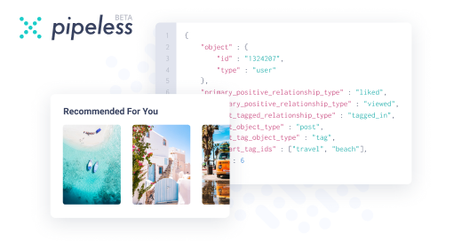
From the creators of devRant, Pipeless lets you power real-time personalized recommendations and activity feeds using a simple API
Learn More
Comments
-
 xociety6698yYeah some desiners love points. But dude he should know better. Of course pts are bigger than pixels.
 -
Please tell me you convert those font sizes to em/rem, and that you don't hard code font sizes in pixels! 😨
-
 beofett3697y@NathanDoesDev I specify a base font size in the HTML tag, and use rem for all font sizing.
 -
@beofett so you hard code a font size in pixels and then use em/rem for setting font sizes relative to that hard coded font size? Or is the base font size em/rem based as well?
-
beofett3697y@NathanDoesDev typically I use 10px, so all my rems can be expressed as simple decimals. E.g. 1.8rem for what should default to 18px on a user agent with no overrides.
-
beofett3697y@NathanDoesDev care to explain what's wrong with it? I believe I picked that up as a duggedtion from one of Chris Coyier's guides, but that was quite a few years ago.
-
@beofett when you set a hard coded font size in pixels, if a user with a disability who increases their font size in the browser settings accesses your website then their option will be overridden by that hard coded value. It's just bad for accessibility.
-
beofett3697yBah. Just checked my base stylesheet. Its actually 62.5% as my base font size in the HTML tag styling, as suggested in a guide by Jim Dnook, not Chris Coyier.
Honestly, it's been years since I looked at the templates I was using when I built sites from scratch. -
@beofett an easy way to convert your sites is to just assume that 1rem = 16px and use math to convert pixels to rem.
Edit: just saw that you use 62.5% so that's awesome :) -
beofett3697y@NathanDoesDev I generally provide a built in font-size scaler on sites, to provide easy resizing.
But its been awhile... does it still override agent font scaling if you derive using rems for all document children? -
@beofett if you use rem and em then the the browser setting will influence the font size like it should.
I use rem and em (or %) for everything. Text, layout, media queries, all of it. That way if a user increases the browser font size then the whole site gets larger for them without breaking! -
beofett3697y@NathanDoesDev I gave up on trying to go 100% ems for layout at my last job due to the problems with the graphic designer.
At my current position, I've just started transitioning to vh and vw for layout. I'm still getting used to it, but I love it so far! -
@beofett I don't even worry about the graphic designer because I just convert px to rem :P

At a previous job, I worked with a graphic designer who knew it all.
The first design he gave me, all font sizes were in points, and way too big.
I asked for them in pixels.
He said points and pixels are exactly the same.
I explained that they were not, when you're using a browser. He got visibly angry, and stormed out of the office to cool down.
When he came back, I sent him a link explaining the difference between points and pixels for digital media.
He sent me pixel sizes.
Next project, same exact thing happens, complete with him angrily storming out of the room.
By the third project, I just started picking my own font sizes, and ignored his point specs.
undefined
designer vs developer