Join devRant
Do all the things like
++ or -- rants, post your own rants, comment on others' rants and build your customized dev avatar
Sign Up
Pipeless API

From the creators of devRant, Pipeless lets you power real-time personalized recommendations and activity feeds using a simple API
Learn More
Related Rants

 My friend said an intern designed this UI for an internal site.
No. Just... no
 Product dev: We need a new volume slider for ou...
Dev: Say no more!
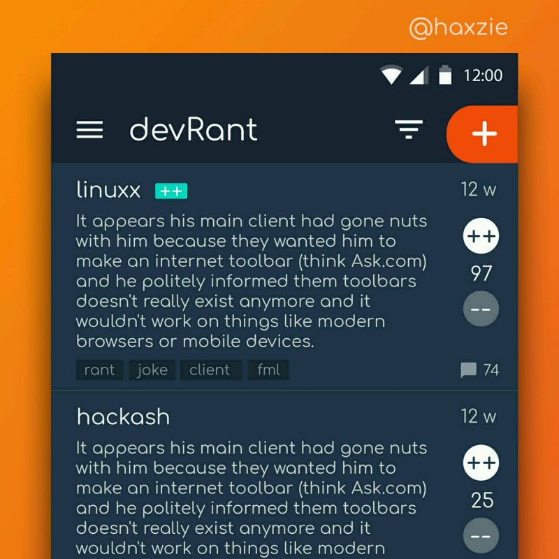
 Been looking around ways to improve devrant's user experience a little, Idk whether you guys like it or not.. ...
I cannot remember having seen a more unethical and pushy user interface than the one of viagogo.
I'm a frustrated to close the entire tab within the first 10 seconds. It's a sad story on on how it tries to instill a sense of urgency to BOOK NOW!
100 people are looking RIGHT NOW at the YOUR offer! Stop thinking, act fast! BUY IT, YOU FOOL OR IT IS GONE!
Here, see all those other options are already sold out m( Oh look, that option over there? Just sold out in this very instant you lazy ass.
I have seen something similar on booking.com and airbnb, yet this egregious implementation truly gets my blood boiling and sets a new low.
I'll take my business elsewhere.
If you develop a web shop, treat your customers as actual adults. Let them breathe. Let them make an informed decision.
If you need to rush them, your business model is broken.
If my employer would ask me to develop something like that, I'd escalate hard. If that wouldn't suffice, I'd reject implementing that anti-feature and would look for a new job out of principle.
rant
13337 devs are looking at this rant right now
unethical behavior
book now
why are you slacking off
upvote now
pushy
fraud
ui