

Join devRant
Do all the things like
++ or -- rants, post your own rants, comment on others' rants and build your customized dev avatar
Sign Up
Pipeless API
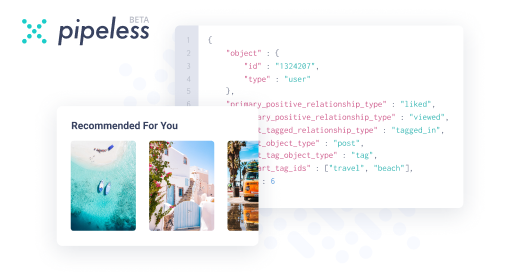
From the creators of devRant, Pipeless lets you power real-time personalized recommendations and activity feeds using a simple API
Learn More


Related Rants


 It all makes sense now...
DevRant v1.12.3.0 The original icon is way better than the adaptive icon. Pls, no.
devrant
android
adaptive icon