

Join devRant
Do all the things like
++ or -- rants, post your own rants, comment on others' rants and build your customized dev avatar
Sign Up
Pipeless API
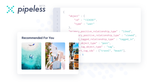
From the creators of devRant, Pipeless lets you power real-time personalized recommendations and activity feeds using a simple API
Learn More


 You left me a tiny hole to look through, I can’t even PUT FUCKING AWAY that garbage and you expect me to tru...
 I have no idea how this tab opened, maybe I clicked something, but it's really interesting to look through, re...
Just been browsing Awwwards about websites: https://www.awwwards.com/websites/
All of that is unusable crap and achieves "clean" design mostly by not having functionality. The trick seems to be a useless fat image and tucking away functionality as small as possible. This is design wankery.
rant
design shit
awwwards