
Join devRant
Do all the things like
++ or -- rants, post your own rants, comment on others' rants and build your customized dev avatar
Sign Up
Pipeless API
From the creators of devRant, Pipeless lets you power real-time personalized recommendations and activity feeds using a simple API
Learn More


 The honest website ever... 🙌🏻🙌🏻🙌🏻
 Reality
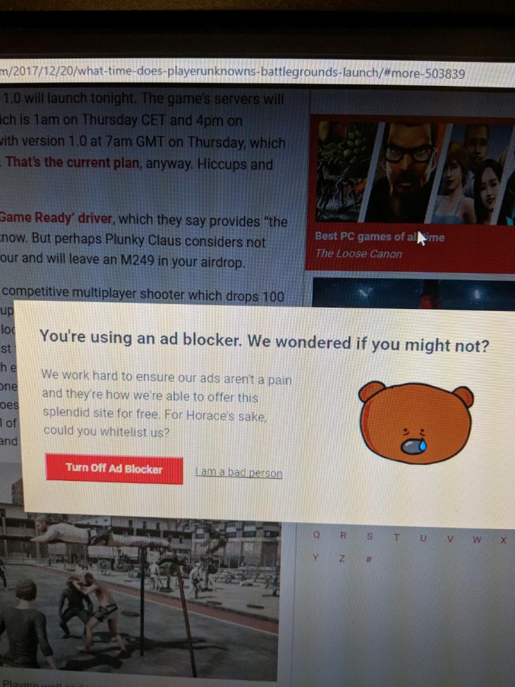 This is by far the best please turn off your Adblock I have ever seen. I actually paused my ad blocker 😂
our recent work. www.ayumanthra.com
undefined
website
web designing