Ranter

Join devRant
Do all the things like
++ or -- rants, post your own rants, comment on others' rants and build your customized dev avatar
Sign Up
Pipeless API
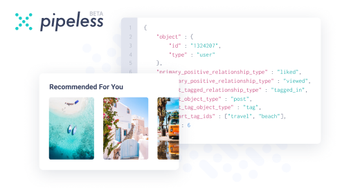
From the creators of devRant, Pipeless lets you power real-time personalized recommendations and activity feeds using a simple API
Learn More
Comments
-
 C0D4695495yIt’s bootstrap and copy/paste nav and hero, could be worse.
Only thing I don’t agree with is the file naming convention but you’ll learn.
Plus that’s some serious black theme you have that’s bleeded into the Windows taskbar. -
C0D4695495y@rithvikp i think you're right. the windows high contrast i find way to over powered. but they dont have anything "stock" mid way :(
i like it dark but its still got to be usable.
-
 sysvinit8635yOh my lord, please give this man some dark ui themes with less contrast.
(One dark is not bad for web languages or checkout Monokai Pro) -
 mszaf1915yIf you're interested in a nice but still usable high contrast theme.
Search material-theme and then pick the ocean high contrast. It's beautiful


cool or naa? for a beginner
random