
Join devRant
Do all the things like
++ or -- rants, post your own rants, comment on others' rants and build your customized dev avatar
Sign Up
Pipeless API
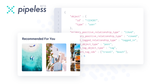
From the creators of devRant, Pipeless lets you power real-time personalized recommendations and activity feeds using a simple API
Learn More


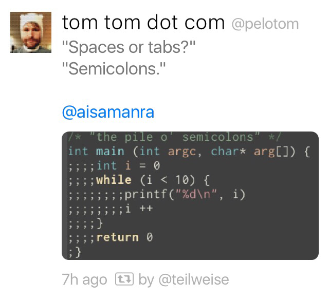 Spaces or tabs? - Semicolons!
 Tabs v spaces again
 Electronic Computer
Same Location
Electronic Computer
Same Location
Tabs at the top on mobile with no swiping between them. OK, @dfox, I'll just use my 6" thumb to reach them...
undefined
tabs
location
hell
why would you do that