
Join devRant
Do all the things like
++ or -- rants, post your own rants, comment on others' rants and build your customized dev avatar
Sign Up
Pipeless API
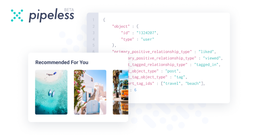
From the creators of devRant, Pipeless lets you power real-time personalized recommendations and activity feeds using a simple API
Learn More


 The aCalendar app let's you choose vibration pattern, it's one of the better settings I've seen.
 When you take User Experience to the next level. Just what I was thinking
Credits : Riot App
When you take User Experience to the next level. Just what I was thinking
Credits : Riot App
 Made my day 😂😂
Microsoft after changing the toolbar buttons layout in Outlook from horizontally aligned on the bottom to vertically aligned on the left edge:
"Yeah there is absolutely no way to fit the To Do and the Notes buttons together with the other three on the left edge. We need a popup menu there!"
rant
outlook
ux
microsoft