Join devRant
Do all the things like
++ or -- rants, post your own rants, comment on others' rants and build your customized dev avatar
Sign Up
Pipeless API
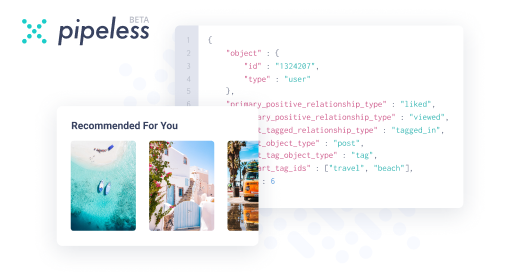
From the creators of devRant, Pipeless lets you power real-time personalized recommendations and activity feeds using a simple API
Learn More


I absolutely hate software that throws error message boxes that look identical to their "please enter new password" message box.
User called and said they needed their password reset. I give them a temp pin and tell them to press ok to the prompt and then put new password in. She says it is still saying invalid pin. This goes on for 10 minutes. I hang up and try on my laptop. Works fine. Then it hits me.
The message boxes look the same. Have the same width and height and shitty little yellow triangle with ! In the middle. The only difference between them is the text in size 9 font.
Gotta read people...cause sometimes the people developing your software assume you can. And to all the software people out there....end users don't want to fucking read.
undefined
readwhat